Slidesgo Review — A Presentation Expert’s Honest Breakdown
Quick answer:
Slidesgo is one of the best free tools out there for grabbing good-looking slides quickly.
But if you’re delivering client work or charging for your designs, it has major gaps. Great for fast drafts, not for polished decks.
What Is Slidesgo? And Who Actually Uses It?
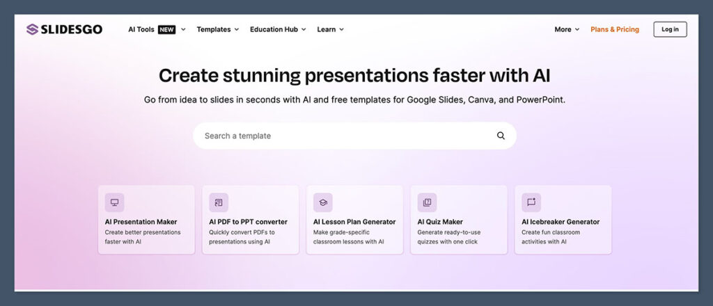
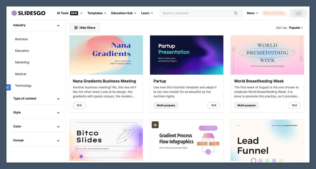
Slidesgo is a free template library for PowerPoint and Google Slides.
It’s designed to help anyone — teachers, marketers, students, and yes, even designers — create slide decks faster. But here’s the catch: not every template is client-ready, and you have to be careful about licensing.
When I first discovered Slidesgo, I was working on multiple low-budget projects at once. I needed something fast that looked clean and required zero effort. Slidesgo delivered — to a point.
Here’s what Slidesgo gives you:
- Thousands of slide decks (PowerPoint and Google Slides versions)
- Pre-built themes in every category (education, startup, medical, etc.)
- Clean filtering by colour, style, and topic
- Most decks are free — but attribution is required unless you pay for premium
- Works perfectly in Google Slides and decently well in PowerPoint
But here’s the reality for pros like me:
- Most templates are overused — you’ll see the same ones in YouTube videos and class projects
- Formatting breaks if you change fonts or colours
- Attribution can be a legal grey area in commercial work
- They’re not designed for real-world business use — no brand cohesion, no customisation flexibility
Verdict: Slidesgo is perfect if you’re building internal slides, training decks, or idea mockups. Not the tool I’d recommend for client-facing work or agency deliverables.
What Slidesgo Does Really Well
I’ve tested a lot of free and paid template libraries over the years — from Canva and Envato to niche marketplaces and fully custom deck platforms.
Most of them come with trade-offs. What impressed me with Slidesgo is how consistently it delivers value at zero cost — especially when speed and simplicity matter more than deep design flexibility.
Let’s break down what it actually does well.
1. Speed
Slidesgo is one of the fastest ways to go from “blank slide” to “decent-looking deck.”
You don’t have to register, log in, or fumble through layers of UI. You search, click download, and you’re editing a working file within minutes.
For me, this is ideal when I’m mocking up a concept for a client, brainstorming layout ideas, or putting together placeholder content for a workshop.
If you’re juggling deadlines and just need a visual to get things rolling, this is where Slidesgo shines.
2. Categories and Filters
The library is massive — thousands of templates — but you don’t feel overwhelmed thanks to smart filters.
You can drill down by:
- Colour palette (useful if you already know your brand colours)
- Topic (like marketing, education, medical, tech)
- Visual style (from minimalist and corporate to playful and geometric)
- Format (PowerPoint or Google Slides)
This filtering system is better than what I’ve seen in most paid marketplaces. Even Envato can feel clunky when you’re trying to isolate a clean, modern deck for a pitch.
Slidesgo lets you narrow in on usable designs quickly — a massive time-saver.
3. Dual Format Compatibility
This is a big one for teams.
Every Slidesgo template includes files for both PowerPoint and Google Slides. No weird conversion issues, no paywall to unlock both formats. That flexibility means I can:
- Edit offline in PowerPoint when I want total control
- Collaborate in Google Slides when I’m working with clients or teammates remotely
- Preview layouts in both tools to spot formatting issues before final delivery
Very few free template sites offer that kind of compatibility without strings attached.
4. Template Variety (That Goes Beyond Title & Bullet)
Slidesgo templates go further than the usual “title and content” layouts you’ll find in other free libraries. This matters because real-world decks need more than headers and paragraphs.
Here’s what I’ve found inside most templates:
- Data slides with editable charts and graphs
- Device mockups (iPhones, laptops, tablets — already placed for you)
- Process flows, timelines, and step-by-step visuals
- Icon libraries built into the slide deck — all editable vectors
- Section break pages with consistent transitions
While the design style isn’t always refined, the functional variety is high. You could easily build a full training workshop, webinar, or onboarding deck using just one template.
5. Visual Consistency Within Each Deck
Not every template is a hit — some feel messy or inconsistent — but for the most part, each deck has a clear visual rhythm.
Fonts are matched across slides, colours are applied evenly, and layout spacing is reasonably tight.
I’ve used some paid libraries where you get 100 slides, but only 10 are actually usable without tweaking. With Slidesgo, I often get 20+ usable layouts right out of the gate.
Here’s a quick comparison with other platforms:
| Feature | Slidesgo | Canva | Envato Elements | SlideCarnival |
|---|---|---|---|---|
| Template Variety | High | Medium | High | Medium |
| Editable Icons Included | Yes | No | Yes | Yes |
| Data & Chart Slides | Yes | Yes | Yes | Some |
| Device Mockups | Yes | No | Yes | No |
| Format Options (PPT & Slides) | Yes | Limited | Yes | Yes |
Verdict:
Slidesgo delivers high-speed, low-friction presentation templates that are perfect for mockups, internal decks, and idea validation.
It’s not original — you’ll spot the same templates all over the internet — but it is incredibly useful when you’re short on time and just need something that works.
For freelancers, teachers, or early-stage founders, this tool fills a real need without eating up your day or your budget.
For pro designers? It’s more of a sketchpad than a finished product — but that still has value in the right hands.
Where Slidesgo Falls Flat
Slidesgo is useful — no question about it.
But once you move from hobby projects or classroom slides into the world of paid design, the cracks start to show.
If you’re building decks for clients, pitching for real money, or trying to stand out in a competitive space, there are limitations that become deal-breakers fast.
Here’s where Slidesgo starts losing points — and why I rarely rely on it beyond the first draft.
1. Attribution Kills Commercial Use
This is probably the biggest blocker for professionals.
If you’re using the free version of Slidesgo, you’re legally required to include an attribution on your deck.
That might sound like a small ask — until you’re presenting to a board of directors or an investor panel and have to stick “Slidesgo” in the footer.
It completely undermines the credibility of your work.
Even if the design looks solid, the presence of attribution signals that you’re using off-the-shelf tools — and that’s not a message I ever want to send as a designer.
Why It’s a Problem:
- Breaks trust in high-stakes presentations (investor decks, enterprise clients)
- Legally risky if you forget to credit — you could breach their license
- Unscalable if you’re building dozens of decks across clients or industries
Workaround?
Yes, you can pay for the premium license to remove attribution — but at that point, you might be better off with platforms that give you more control and better licensing to begin with (like Envato or SlideModel).
2. Design Consistency Isn’t Pro-Level
As a designer, consistency is everything. The wrong font pairing, off-balance spacing, or misaligned elements make a deck feel unprofessional — even if the content is strong.
Slidesgo templates often come with:
- Clashing font styles within the same deck
- Overly decorative slide layouts that distract from content
- Weak typographic hierarchy (titles that blend into body text)
- Inconsistent iconography — some hand-drawn, some flat, some 3D
It feels like a mash-up of design trends rather than a cohesive, branded experience.
Here’s a real-world example:
I once tried using a Slidesgo layout for a SaaS investor deck. The slides looked clean at first glance, but when I started adding the client’s colours and fonts, the whole thing broke down.
Text ran over images, margins shifted, animations became awkward. I ended up redoing most of it manually.
It was more work than starting from scratch.
3. Google Slides Bugs and Formatting Issues
While I like that Slidesgo supports Google Slides, I’ve run into technical glitches way too often to trust it fully for delivery.
Common issues I’ve seen:
- Fonts not rendering properly (especially custom fonts)
- Charts losing formatting or turning into static images
- Line breaks moving when you adjust text boxes
- Slide master edits not sticking
- Animations behaving differently across browsers
If you’re prepping a deck to be viewed across different platforms — say, the client wants to use Google Slides but present in PowerPoint — Slidesgo becomes fragile.
You’ll find yourself spending hours troubleshooting layout problems instead of refining your message.
For internal brainstorms? Fine.
For client-ready delivery? Risky.
4. Everyone’s Using It
This one’s subtle — but it matters.
Slidesgo is everywhere. That’s great for accessibility, but not great when originality matters.
I’ve had multiple clients send me a Slidesgo deck saying “We like this style” — without realising it was a free template that half the internet has already used.
The moment your work starts to look like a Canva or Slidesgo design, you’re competing with anyone who has internet access — not just other designers.
Why that’s a problem:
- It kills uniqueness — everyone’s drawing from the same library
- You can’t charge premium rates for a design they could find in 30 seconds
- It damages your positioning as a custom solutions provider
You don’t want your work showing up in a “Top 10 Free Template” roundup.
Verdict:
Slidesgo works if you’re okay with average. And in some scenarios, average is fine — internal decks, school projects, small team meetings.
But if you’re charging for your work, presenting to high-stakes audiences, or trying to differentiate yourself in a crowded market, you’ll hit the ceiling fast.
It’s a great starter, but not a finisher. When quality, brand alignment, and uniqueness matter, you’ll need to upgrade to more robust tools — or better yet, build from scratch.
How Slidesgo Compares to Other Presentation Tools
When you’re choosing a presentation tool, the key question isn’t just “Is it free?” — it’s “Can it support the level of work I’m trying to deliver?”
That’s why I always compare tools based on how they perform in a real design workflow, not just what’s advertised on the homepage.
Slidesgo serves a different kind of use case than a tool like Beautiful.ai or Envato Elements.
But when you stack them up side by side, the differences are pretty clear — especially if you’re a designer or someone whose slides are tied to business outcomes.
Here’s a snapshot of how Slidesgo compares to five other popular tools I’ve worked with regularly:
Presentation Tool Comparison
| Tool | Best For | Customisation | Licensing | Cost | Pro Use? |
|---|---|---|---|---|---|
| Slidesgo | Free templates for students, teachers | Low | Requires attribution (unless paid) | Free / Premium | No (too generic) |
| Canva | Social media slides & marketing | Medium | Clear (premium assets can be risky) | Free / Paid | Sort of (lite decks) |
| Envato Elements | High-volume agencies, designers | High | Fully commercial safe | Paid ($16.50/mo) | Yes |
| Beautiful.ai | Startups, founders, busy execs | Medium | Commercial OK | Paid ($12/mo+) | Yes |
| PowerPoint Designer | Microsoft users | Medium | Commercial OK | Paid (via Office) | Yes |
Let’s Break That Down
Slidesgo: Great Entry Point, But You Hit the Ceiling Fast
Slidesgo is simple, free, and incredibly fast. That makes it great for:
- Teachers and students
- Internal training decks
- Fast prototyping
But once you need:
- Custom branding
- Animation control
- Full licensing clearance
…it starts to fall apart. The lack of deep customisation and reliance on attribution make it risky or inappropriate for most commercial use.
I treat Slidesgo like a whiteboard sketch. It’s where ideas form — not where they’re finalised.
Canva: Strong for Marketing, Weak for Real Decks
Canva has come a long way. Its slide templates are solid, and you can easily tweak colours, fonts, and layouts. It’s ideal if you’re building:
- Social media carousels
- One-off slides for ads or content
- Brand kits for small businesses
But for large decks or formal presentations? It falls short.
You’re stuck in Canva’s ecosystem, and exporting to PowerPoint often breaks the layout. Plus, using paid design assets without fully understanding the licensing can open you up to headaches.
Best for: Marketing teams, startups, creators — not agencies or consultants.
Envato Elements: My Go-To for Premium Templates
If you’re working on client-facing decks, Envato Elements is miles ahead of Slidesgo. You get:
- Thousands of slide decks with pro layouts
- Full licensing coverage for commercial use
- Infographic bundles, pitch decks, webinar packs, and more
- Templates with better spacing, typography, and structure
I use Envato regularly when a deadline is tight, and I need a polished, consistent slide foundation that won’t embarrass me in front of a CMO.
It’s paid, but totally worth it if you’re billing for your work.
Beautiful.ai: Great for Startups and Founders
Beautiful.ai automates the design work, keeping everything aligned and consistent. It’s fantastic for:
- Busy execs who don’t want to mess with formatting
- Founders building pitch decks
- Sales teams who present regularly
Its AI logic prevents you from making ugly slides — but that also limits creative control. Designers will feel boxed in quickly.
I don’t use it often, but I recommend it to clients who want to edit and present on their own after handoff.
You won’t build the most unique deck here, but you will build a clean one — fast.
PowerPoint Designer: Built-In But Limited
If you’re already deep into Microsoft Office, PowerPoint Designer offers decent auto-layout suggestions. It:
- Saves time by suggesting slide designs as you type
- Works well for internal decks or structured data
- Integrates directly with Office 365
But it’s basic. You won’t get style cohesion or polished templates. It’s a supplement — not a replacement — for real design work.
I turn it off 90% of the time because it gets in the way. But for beginners? It can help avoid a design disaster.
Verdict:
Slidesgo has the lowest barrier to entry, but also the lowest ceiling.
If you’re just starting out, or if you need to build something simple without any budget, Slidesgo does the job. But if you care about design quality, brand consistency, or client impact — you’ll quickly outgrow it.
Here’s how I typically recommend:
- Slidesgo = Brainstorming, student work, fast MVPs
- Canva = Social media slides, small business marketing
- Envato = Paid client work, polished decks, agency use
- Beautiful.ai = Startup pitch decks, self-serve execs
- PowerPoint Designer = Light internal use, beginners
Bottom line: Use Slidesgo when you need something now. Use something else when you need something great.
My Top Template Picks from Slidesgo (That Actually Work)
I’ve downloaded and tested more than 100 Slidesgo templates over the last few years — everything from animated pitch decks to corporate strategy slides.
Most look great at first glance, but only a small handful hold up under pressure when you’re using them for real projects.
Below are the only Slidesgo templates I genuinely recommend, based on how well they perform in client work, training sessions, and internal presentations.
These aren’t perfect out of the box — they need tweaking — but they provide a strong enough foundation to be worth your time.
1. Startup Pitch Deck
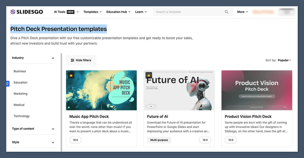
If you’re building out a pitch for a founder or startup, this one’s your best bet on Slidesgo.
What I like most about it is the clean layout and restrained colour use. It doesn’t overwhelm you with gradients or over-stylised graphics, so it’s easier to bring in a client’s branding.
There’s also a good balance of content slides: team bios, timelines, market opportunity — the stuff investors actually look for.
It’s also one of the few templates on the platform that feels close to a real pitch deck in structure. A few tweaks and it’s usable.
Why I recommend it:
- Minimalist palette — easy to rebrand
- Prebuilt charts and diagrams
- Good logical flow (Problem > Solution > Team > Market)
I’ve used this template as a base for two startup decks in the last six months — both turned out sharp after editing.
2. Medical Theme Templates
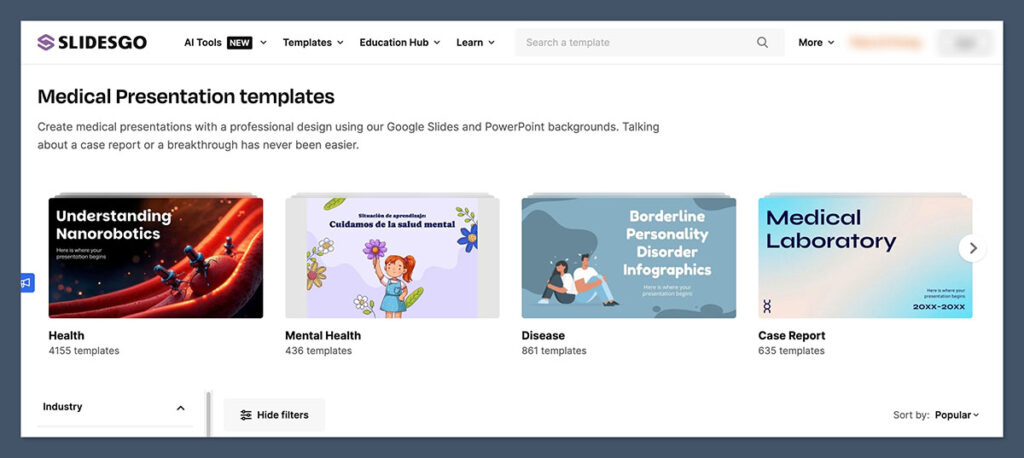
There are multiple templates under this category, but most follow a similar visual structure: icons, blue/white colour schemes, clean shapes.
These are ideal when you’re working in:
- Pharma or health tech
- Wellness coaching
- Nonprofits or education in the health space
What makes these usable is the clear visual hierarchy. The headers stand out, icons are logically placed, and the slides feel easy to digest — crucial in fields like healthcare where clarity is everything.
Highlights:
- Built-in iconography that actually fits the subject matter
- Well-spaced layouts, even on data-heavy slides
- Consistent colour treatment across all pages
They’re also easier to export to PDF than some of the flashier templates, which is a big plus when you’re sending out reports or digital decks.
3. Dark Tech
This one’s more stylised — and definitely not for every client — but when you’re working with a B2B SaaS company or doing a demo for a developer audience, it hits the mark.
The black and dark grey backgrounds give it a modern, tech-heavy feel, and the layouts aren’t cluttered with animations or weird design choices.
You can strip out the default text and swap in product visuals without fighting the structure.
Best used for:
- Product walkthroughs
- Demos and webinars
- Portfolio decks for tech teams
It also performs well in darker environments like conferences or in-room presentations, where white slides tend to blow out.
4. Minimalist Gradient
If you want something neutral and flexible, this is my go-to.
The colour fades are subtle — think soft blues and purples — and the typography is well-sized for both online and in-person presentation.
It doesn’t scream “template,” which is a huge win when you’re trying to keep the focus on the content.
I’ve used this one for everything from product demos to internal team meetings, and it holds up every time. The key is to treat it like scaffolding — remove anything you don’t need, and the core design will still feel polished.
Strong points:
- Flexible layout blocks for visuals, bullets, or mixed content
- Clean use of negative space
- Adaptable for nearly any industry with minimal rework
Pro Tip: Use Them as Structure, Not Final Designs
This is the mistake I see most people make — they treat Slidesgo templates as the finished product.
That’s never the play.
The smart way to use these templates is to treat them like a wireframe:
- Strip out excess design elements
- Plug in your own fonts and colours
- Tighten up the spacing and remove any animations
If you’re delivering a high-stakes presentation, these templates get you 60% of the way there. But the last 40% — the polish, clarity, and strategy — that still comes from you.
Is Slidesgo Good for Professional Designers or Agencies?
Short answer: No.
Long answer: Only if you’re mocking something up in a rush and need a visual placeholder.
I’ve tested Slidesgo across everything from pitch decks and webinar slides to client mockups and internal training content.
And after using it in dozens of real scenarios, here’s my take: Slidesgo doesn’t hold up in professional environments where presentation quality directly impacts perception or business outcomes.
It’s a starter tool — not a delivery tool.
What Slidesgo Is Built For:
Slidesgo serves a very clear purpose, and it does that well. It’s designed for:
- Speed
When you need to produce slides in minutes, not hours. No account required, just pick a template and download. - Simplicity
The templates are easy to edit, even if you’ve never touched PowerPoint or Google Slides before. No design skills needed. - Low-effort visual structure
Great for people who want a decent-looking result without obsessing over layout, spacing, or font hierarchy.
If you’re a teacher prepping a lesson, or a team lead needing slides for a quick internal presentation — Slidesgo is more than enough. It’ll give you something that looks organised and reasonably clean, with zero fuss.
What Slidesgo Is Not Built For:
When it comes to pro-level presentation work — the kind where slides need to sell, convince, or build trust — Slidesgo falls short. There’s just too much missing under the hood.
- Brand Alignment
You can’t control enough of the design to make it truly match a client’s brand identity — fonts, iconography, visual style, and layouts all have their limits. - High-End Client Delivery
If you’re sending a Slidesgo deck to a paying client, it’s obvious — especially to stakeholders who’ve seen these templates reused in other contexts. - Strategic Storytelling
Most Slidesgo templates are just slide layouts with placeholders. They don’t support narrative structure, pacing, or the kind of intentional visual flow you need in enterprise or agency work.
I’ve had clients call out Slidesgo-style decks in feedback sessions before. It doesn’t take much for a savvy stakeholder to recognise a free template, and once they do, it hurts your credibility — even if the content is good.
Who Should Actually Use Slidesgo?
Here’s a simple breakdown:
| User Type | Should You Use It? | Why? |
|---|---|---|
| Freelance Designer | ❌ Avoid | You’ll look unoriginal, and licensing is restrictive |
| Teacher / Coach | ✅ Great Fit | Quick, simple, and easy to customise just enough |
| Startup Founder | ✅ Start Here, Then Upgrade | Use for MVP decks, but switch to custom before pitching investors |
| Marketing Team | ❌ Use With Caution | Fine for internal updates, but not campaign decks |
| Agency | ❌ Avoid Entirely | Client-ready work needs better structure, licensing, and visual control |
Verdict:
Slidesgo is like a frozen pizza.
It’s fast. It’s easy. It fills the gap when you’re in a bind.
But it’s not what you serve when you’re trying to impress, sell, or build trust with a client or audience.
There’s nothing wrong with using Slidesgo when the stakes are low. Just don’t let it become your default for professional design — because the cost of looking generic is always higher than the time saved.
Final Verdict: Should You Use Slidesgo?
If you’re a presentation designer like me, Slidesgo isn’t your main tool — it’s your plan B. Maybe even plan C.
It has a place in the toolkit, no question. But that place is not anywhere near high-stakes client work, pitch decks, or anything tied to your professional reputation.
Slidesgo is useful for what it is: a free, fast-access library of visual ideas and layouts. It helps you move quickly, especially when you’re stuck staring at a blank slide or running behind on a deadline.
But when it comes to polished output? You’ll hit its limits fast.
Where Slidesgo Makes Sense:
Use it when:
- You’re drafting internal slides for a meeting or report
- You need a visual framework for a brainstorming session
- You’re supporting students or educators who just need to get slides done
- You’re mocking up a quick demo or wireframe to show structure before redesigning
In these cases, you’ll get real value from Slidesgo — especially if you don’t want to build every deck from scratch.
Where Slidesgo Falls Apart:
Avoid it when:
- You’re building a deck that represents a brand, product, or service
- You’re working on sales presentations, investor pitches, or webinars
- You’re delivering to executive stakeholders or external partners
- You’re trying to stand out as a freelancer or design professional
These scenarios demand more than quick layouts. They require visual storytelling, trust-building, and polish.
And Slidesgo simply doesn’t give you the tools, structure, or flexibility to deliver that level of quality without redoing most of the work yourself.
Ask Yourself This:
Before you grab a Slidesgo template, ask:
- Will anyone outside of my team or classroom see this deck?
- Is this a final presentation or just a draft?
- Will using this template make me look generic — or polished?
If your answer leans toward “final” or “client-facing,” move on. You’ll waste more time fixing problems than building value.
Final Call:
Slidesgo is a good place to start, but a bad place to end.
It’s a tool you reach for when you need something quick and clean — not when you need to wow a room, land a deal, or build trust with a paying client.
In the right hands and in the right context, it’s useful.
Just don’t mistake “free and fast” for “client-ready.”

